Pot2Colle

Introduction

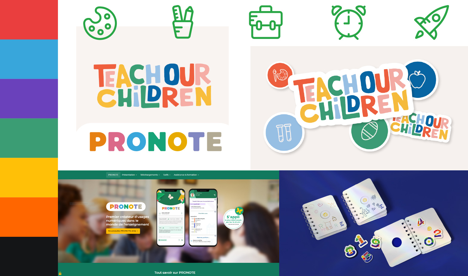
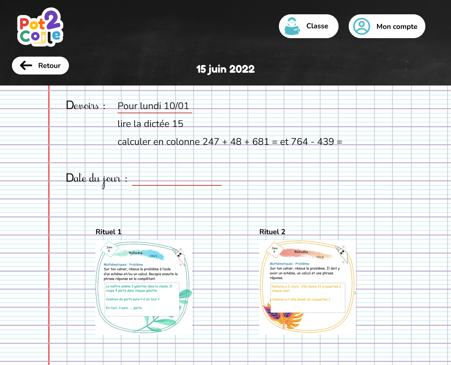
"Pot2Colle" is a website developed by a teacher for these elementary school students. As part of a professional seminar, we had to make a proposal and recommendation to update the site on its graphic aspect and clean up the code.

We were a team of 10 people, 3 developers, 2 communicators and 5 graphic designers.

moodboard of the new visual aspect

What to do ?

arborescence

Our client asked us to do several tasks :

First of all he wants us to review the graphic aspect of the site knowing that the site is used by children of about 8-10 years old and that they often use their phone.

Secondly, he wanted us to look at the code he was able to do and redesign it to be lighter and easier to use.

Finally, he wanted to have a discussion space for the students, a blog, where they could share and communicate. It is necessary to be careful with the written word and to moderate the exchanges.

Our vision

By analyzing the "pot2colle" website, we saw that it lacked colors and joy, elements often represented for children. We wanted something simple and not complex so that users would not get lost but a young and colorful look.

So we took a more childlike artistic direction, with colors representative of the materials. The highlighting of school objects allowed for a more age-appropriate imprint.

For the code part, we opted instead for the organization of the code, to make it simpler and more usable. Especially since we chose to redo a base in the MVC model to facilitate the use and programming by the client.

mockup of the homework page